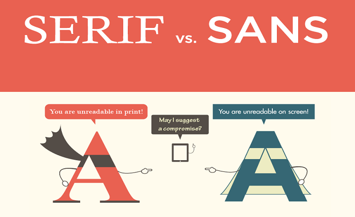
Fonts may seem subtle, but they can make or break your message’s impact. Serif and sans serif are two distinct font families used for centuries, but which should you choose? Do their differences matter in print and digital media? Join us on this journey as we explore the nuances of each typeface and learn how they can influence your design’s effectiveness. Whether you’re a graphic designer or just someone who wants to understand typography better, this post is for you. Here we will talk about the difference between serif and sans serif.
What are Serif and Sans Serif Fonts?
Serif fonts are typography hallmarks characterized by small feet or tails on the lowercase characters of a typeface, typically in a ratio of two to five. Sans serif fonts are typography hallmarks characterized by straight strokes that run the length of the letterforms, typically with no feet or tails. Serif and sans serif fonts are popular for body text in printed materials. They give a more professional appearance than sans serif fonts alone. However, digital media can also use them for headings, paragraphs, and other text elements.
Many different types of serif and sans serif fonts are available on commercial and free computer systems. Some common serif fonts from TypeType include:
- TT Norms Pro Serif
- TT Livret
- TT Rationalist
- TT Ramillas
While common sans serif fonts include:
- TT Commons™ Pro
- TT Lakes Neue
- TT Bluescreens
- TT Rounds Neue
What are the Differences between Serif and Sans Serif Fonts?
Serif and sans-serif fonts are two types of typography that differ in several ways. Serif fonts have small tops and bottoms to the letters in a word, while sans-serif fonts do not. Sans serif fonts are often easier to read on-screen or printed due to their lack of detail. Serif fonts are typically used for text that will be seen in print. In contrast, sans serif fonts are more commonly used for digital media. Additionally, serif fonts tend to be more expensive than sans-serif fonts.
Which Font is Best for Your Print or Digital Media Projects?
Choosing the right font is important if you’re looking to create a professional print or digital media project. Serif fonts are typified by their serrated edges. They’re typically used for printed materials, giving the text a more polished look. On the other hand, Sans Serif fonts have smooth edges and are popular for online content because they look less formal.
There’s no right or wrong answer regarding font choice. Still, some factors to consider are the typeface’s legibility in different sizes and styles, compatibility with your website’s design and color palette, and whether or not you want to add an extra layer of professionalism. Ultimately, deciding which font suits your needs is up to you.
Conclusion
There are many different styles fonts available online. Here we have told you the differences between serif and sans serif. Sans serifs are easier to read on a screen. Serif fonts can be more beautiful when set in large text or used for headings. Still, they usually work better for headlines because they’re easier to scan. Sans serif fonts also work well for headings, but they often look better if the letters are slightly staggered so that they “pop” off the page.


